 The first time I ever saw a Moo card, I fell in love. (I like tiny things.) I made a set of Moo cards for Francophilia that I hand out here and there. But I soon decided that Moo cards were cute, but not terribly practical. But when Squiz, a new Moo competitor, offered me and my fellow WebWorkerDaily bloggers a set of free cards, I decided to check them out anyway. My curiosity was piqued. How could you beat Moo, with their great site, service and products, and why would you want to try?
First impression of Squiz: excellent site. Zero blah blah, let’s get right down to having fun. And I was thoroughly entertained playing with the avatars on the home page…
They’re in matching pairs: business woman, business man, etc. However, the young man avatar has a backpack and books and glasses and looks generally brainy, while his female counterpart looks like a cheerleader… Oops. Adding a college quarterback type and a brainy college girl would balance things out nicely…
The idea is to pick the avatar you relate to and click “See which cards I like.” Then you’re taken to a page with Squiz card templates that should appeal to your “type.” (Or you can be boring and just hit the “Squiz Card Templates” link or the “Make my Squiz Cards now!” button.)
 I got stuck on the avatars for a while, though, because I couldn’t pick a type. I’m a composite of four or five of them, depending on my mood and what I’m doing… But that’s half the fun and, as a user, I was engaged.
This is the avatar I picked. That’s how I looked in college in the 80s, but with better posture…
By the time I figured out which of my selves was dominant at that moment (Sybil, anyone?), and would most like to have a Squiz card, I was really looking forward to seeing which templates “went” with her. Then I went back and looked at the templates they’d assigned to my other selves too. I was seriously engaged. Well done, Squiz.
It didn’t take long for me to pick a card. The only differences, really, between Squiz and Moo are that Squiz cards are plastic and have round corners, they’re about three-fourths as long as Moo cards (smaller = even cuter and even less practical), and they come with a keychain dispenser.
So the fact that they’re waterproof got me thinking of the days when they really would have come in handy, back when I spent all my time at the beach in Hawaii as a teenager.
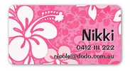
 That explains why this template jumped out at me and took me back, on that fall day in Paris, to a time when half the clothes in my closet looked like this. Didn’t hurt that with the onset of black clothing season in Paris, I have been in a seriously pink mood.
Once I was done playing, and before I ordered a card, I dug around a little to find out if these people making plastic cards and mailing them all over Creation had an environmental conscience. Just what we need is more plastic crap on the planet, one more thing made from petroleum… You’ve heard it here before.
They describe their eco-friendly manufacturing process on the site. As a bit of an environment freak, I’d like to be reassured that the polypropylene pellets they use to make the cards come from recycled stuff to begin with, though.
They also emphasize the fact that the cards are 100% recyclable.  Problem is, nobody’s gonna know that – no card owner (or few), no recipient, no recycling facility – because the symbol that appears on the site (and you have to go looking for it) is nowhere to be seen on the cards themselves. They need to print it prominently, and proudly, on the backs of the cards, next to their logo (and also to display it prominently on the site).
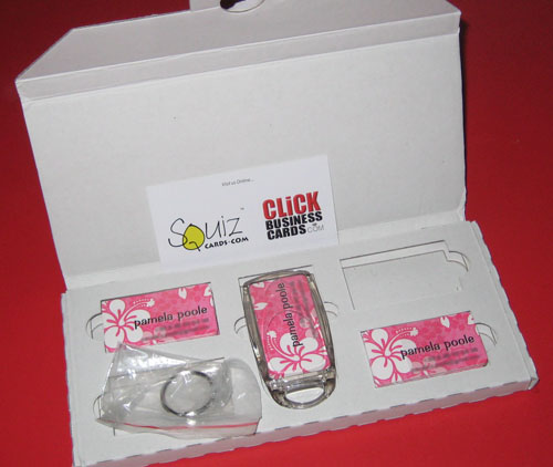
I ordered my pink aloha spirit cards, and they came in this sturdy, custom cardboard box. It’s very nice, but it’s too much packaging, Squiz. The trees. The carbon emissions to ship those extra ounces. The resources to cut and assemble and pack the box… And you could make the dispenser optional. I know I won’t use it.

Last point, dear reader. No they’re not practical, unless you’re at the beach with a stack of ‘em velcroed into the pocket of your board shorts, hoping to meet lots of girls, who will think the cards, and hopefully you by extension, are adorable. But they are fun. They’re “anti-business” cards, and we need more anti-business in our lives. So do check out the site.
You’re probably wondering why I’ve subjected you to all this excruciating detail about something that might seem to you to be insignificant. It’s because I rarely try out a new site without being highly conscious of my own user experience, and I wanted to explore that here, since I was so seduced by Squiz. That’s what happens when you’ve been in startup Lala Land for a few years, write for a techie blog, and are married to a UI design expert.
What interests me is how sites get users engaged and what works/doesn’t work on a site (meaning effective UI and experience, not broken links). I also try to be aware of the psychology and ethics of it all; when and how I’m influenced or manipulated by marketing and presentation, and why I respond.
That a simple site for plastic cards could entertain me for half an hour, take me back to college days with a little cartoon character, take me back to sunny beaches with an attractive template… Pretty powerful stuff. (Of course, I could have just been hormonal that day.)
Anyway, think about it.
(Hey Squiz, I would love to have your background image to play with, and I couldn’t dig it out of your CSS… Will you point me to it if it’s available? Merci !)
